
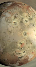
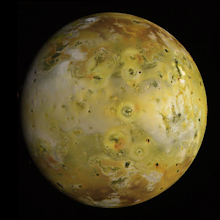
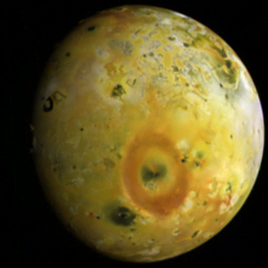
 I had some spare time today so I finished up on creating proper PNG versions of two global color observations from I32, a Galileo flyby that took place in October 2001. I like to use PNG as it provides nice, lossless compression of image data without the compression artifacts often visible in JPEG images. These Io images already have compression artifacts from the on-board compression algorithms when they were taken, we don't need to be adding more. 32ISGLOCOL01 is the higher resolution observation (5.0 kilometers per pixel), but has more noise and compression artifacts, which reduces its effective resolution. This observation provides some color context for the regional observations acquired 11 hours earlier. The other observation, 32ISGLOCOL002 (shown at right) reveals terrain a little further to the west such as Loki and Dazhbog Patera (surrounded by a fading, half-circle plume deposit near upper left). I should note that in this version, I copied in some data from the green filter image to fill a gap in the south polar region in the red filter image. I think the result is pretty seemless, but I have also posted the non-gap fill version.
Turning back to the present, astronomers around the world have been observing and posting on the internet, observations they've acquired of various mutual events involving the Galilean satellites, like Mike Salway's observation of Ganymede's May 25 occultation of Io I posted about yesterday. Hideo Einaga observed the same occulation, creating an animated gif of his data. Efrain Morales Rivera accomplished the same feat. Finally, Christopher Go observed an occultation of Io by Europa on May 31.


anon. for now
ReplyDeleteJohn VV
i was wondering when i did my IO map i removed most of the green . i was under the impression that nasa color was a bit off .
i see in the "new" reworked imaqge you did that there is a lot of green in it . Is there a 100% ( or 90%) "correct" color for io
for an example take a look at my motherload map
by for now .
Looking at your maps in motherlode, it is perhaps a little too red.
ReplyDeleteThe color used in the publicly released images tended to try to pull out differences between different color units, so yes the color there was often a bit off. Many press release images also used the near-IR 756nm filter rather than RED for the red channel. The ones that I have processed here were done a bit more..."naturally", but even then, because Galileo had a violet filter, they are not exactly what you would see with the naked eye. The visible light colors would be a bit more muted than what are seen here, but soem features really are green to yellow-green.
For better results, take a look at Bjorn Jonnson's Io color page: http://www.mmedia.is/bjj/3dtest/io/index.html